About Project
The project was a part of an individual design project to do a UI redesign of a website of our choice. The limit being we could only change the "look" without redesigning the whole UX structure.
The Website:
The Department of Tourism (DOT) Philippines is the government agency responsible for promoting the country as a top travel destination. Its website serves as a comprehensive hub for both local and international travelers, providing essential information on tourist spots, travel guides, accommodations, and cultural experiences. Targeting tourists, travel agencies, and industry stakeholders, the site highlights the Philippines' natural wonders, rich heritage, and upcoming events while offering resources like itineraries, safety guidelines, and investment opportunities in the tourism sector.
THE PROBLEM
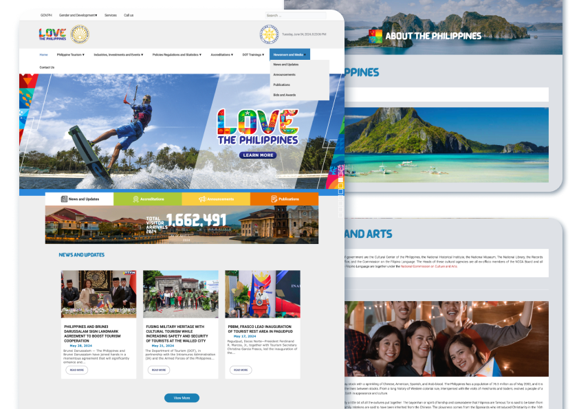
- The overall look and content of the website doesn’t make it appear like it’s supposed to be a tourism page for the Philippines.
- It’s text-heavy from the getgo and cluttered with information that would be irrelevant to potential tourists and travelers, with less of a focus on what the country has to offer in tourism.
- The inconsistent padding and spacing for the layout makes it hard to read through the information given.
Objectives
- Hero & Visuals – Needs high-quality images/videos to capture tourism appeal.
- Typography & Readability – Reduce text overload and improve hierarchy.
- Navigation & Content Focus – Prioritize destinations over bureaucratic info.
- Layout & Spacing – Ensure consistent padding and better structure.
- Imagery & Icons – Use visuals to break up text-heavy sections.
- Color & Branding – Incorporate colors and illustrations from the official "Love the Philippines" Tourism campaign.
Branding & UI
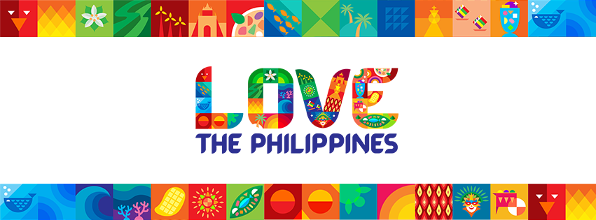
“Love the Philippines” is the current tourism slogan and tourism brand of the Philippines which was officially launched last June 2023.It features saturated, colorful illustrations that represent the country’s vibrant culture

Barabara is a custom typeface designed for the tourism campaign. It was intentionally made to look reminiscent of Philippine jeepney signages that you can find all over the country,
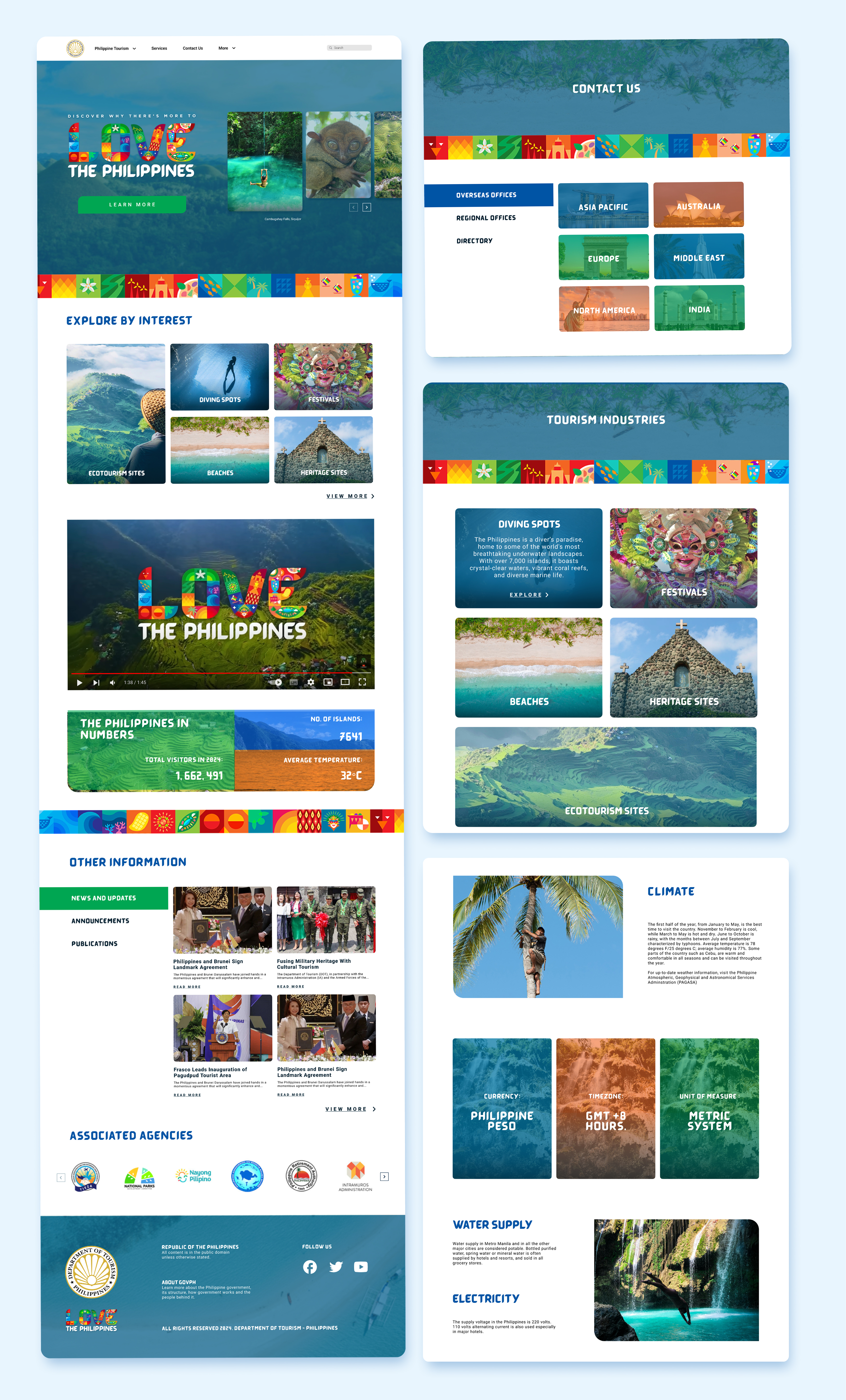
REDESIGN
IMPROVEMENTS
- Navigation is much more organized. Pages that are indirectly related to tourism promotion are under ‘More’, as to keep the information but wont convolute the navigation bar.
- Campaighn logo is scaled up on the landing page gives it more prominence and distinction given it’s intricate illustrations.
- Use of more tourism images to immediately showcase tourist destinations.
- Segmented layout to give a visual break and make info easier to comprehend
- Use of card layout to simplify information
Wireframes